Unlocking Icon Usability: Insights from Cognitive Psychology
Unraveling the Impact of Concreteness, Complexity, and Distinctiveness on User Experience

Icons are integral parts of modern digital interfaces, conveying information from apps to web pages through symbolic imagery rather than text. When designed effectively, icons can transcend language barriers and make navigation intuitive; users should be able to find what they are searching for easily and quickly. On the other hand, poorly conceived icons can confuse and frustrate users.
A recent study by Goetz & Neider (2023) sheds light on how certain features of icons—like how realistic or unique they are—play a critical role in how easily we find and understand them. The findings are particularly useful for UX professionals looking to improve their designs.
Theoretical Foundations: Guided Search and Feature Integration
To improve icon usability it’s important to understand how visual attention works and, in particular, how users search for visual information. For that we have to lean into cognitive psychology and some key theories of visual attention, including Guided Search Theory (Wolfe, 1994) and Feature Integration Theory (Treisman & Gelade, 1980), two prominent cognitive models that explain how visual attention and object recognition work.
The Feature Integration Theory suggests that when we perceive a visual scene, our brain first processes basic features like colour and shape simultaneously across our entire field of vision. However, to recognise specific objects, we must focus our attention on each part of the scene, combining these basic features through a process called "serial binding."
Building on this, the Guided Search Theory proposes that our search through visual environments is a dynamic process influenced by both the characteristics of the objects we see (bottom-up factors) and our own cognitive goals and expectations (top-down factors). Initially, our attention is drawn to salient features like colour or shape, creating a mental map of standout elements. Subsequently, our individual goals and expectations guide our focused search through the environment.
These models inform icon usability — people can quickly notice basic aspects of icons, like their shape or colour. However identifying which icon is which and finding what they’re looking for, requires focused attention and is a deliberate process.
Taxonomy of Icon Traits
McDougall, Curry & de Bruijn (1999) put forth a taxonomy of five key icon characteristics influencing usability and performance to help designers create better icons:
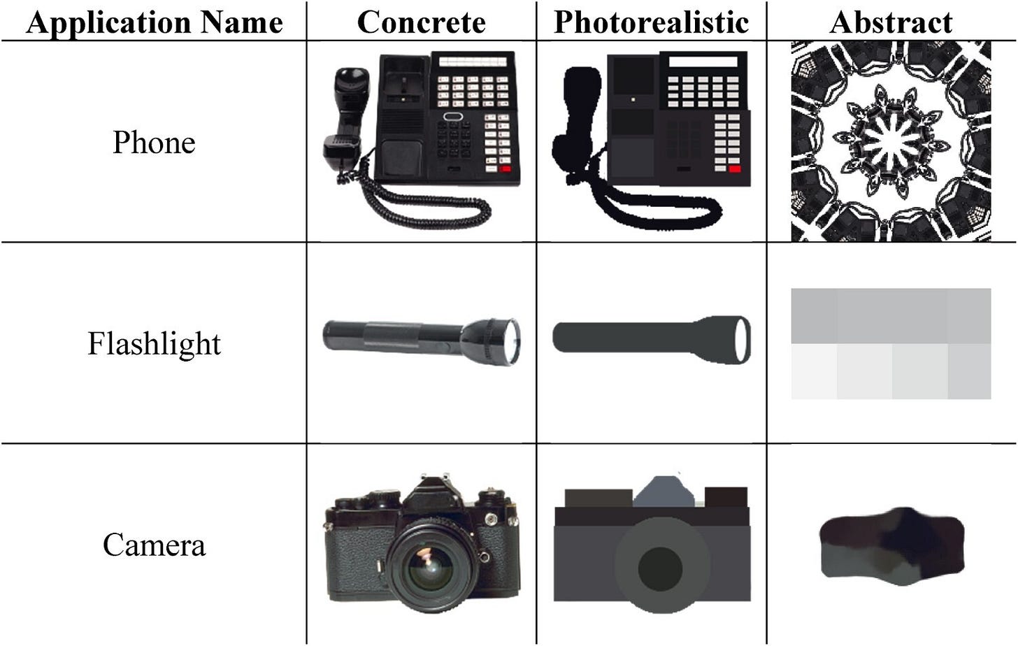
Concreteness: This refers to the extent to which an icon resembles its real-world counterpart. A detailed photograph of a phone, for example, has high concreteness. This realism activates existing mental representations, aiding recognition. Highly abstract icons with symbolic shapes, however, have low concreteness.
Visual Complexity: The amount of intricate details and features in an icon’s image. Icons with multifaceted geometry and textures have high complexity. Simpler shapes have low complexity. Processing complexity requires more cognitive resources which can slow users.
Familiarity: How frequently a user encounters a particular icon. Everyday exposure to common icons like “save” breeds familiarity, improving scannability. Rarely seen icons suffer lower familiarity.
Meaningfulness: How effectively an icon conveys its meaning and function. Icons that metaphorically depict their utility have higher meaningfulness, while ambiguous symbols fail to communicate.
Semantic Distance: The match between an icon’s appearance and its meaning. Icons that directly convey their function have lower semantic distance.
New Insights on Icon Performance
Assessing the relative impact of these traits on icon usability has challenged researchers, with inconsistent conclusions emerging from varying operational definitions of "concreteness" and correlations between icon traits like concreteness and complexity.
Goetz & Neider (2023) attempted to tackle these issues. More specifically, by distinguishing between concrete (photographs), photorealistic (simplified drawings), and abstract (symbolic) icons, their study clarified the construct of concreteness. Participants searched for target icons on simulated tablets while researchers tracked eye movements, assessing how icon traits influenced overall response times and underlying attentional processes.
The findings revealed that concrete icons enabled efficient attentional guidance during search, but increasing visual complexity slowed target verification. Photorealistic icons balanced concreteness with simplicity for optimal speed, while abstract icons lacking realistic cues negatively affected search and recognition. Distinctiveness, defined by an icon's dissimilarity from distractors in basic features like colour and shape, facilitated faster search among clutter.
Based on the findings of Goetz and Neider’s study, several practical implications emerge for UX professionals:
Optimising icon concreteness:
For applications requiring rapid navigation (e.g., emergency medical systems), consider using highly concrete icons.
In apps targeting demographics less familiar with technology (e.g., older adults), concrete icons could reduce learning curves.
Balancing complexity:
Avoid overly intricate designs. While visually appealing, they can slow down recognition and increase cognitive load as they require longer processing times.
In platforms where users engage for longer periods (e.g., creative software), slightly more complexity might be acceptable to convey detailed functionality.
Enhancing distinctiveness:
Distinct icons reduce search times. In crowded interfaces, like control panels, ensuring that each icon is visually distinct is crucial.
Use colour contrasts and unique shapes to make frequently used icons stand out.
Contextual adaptation:
Tailor icon designs to the specific context and user needs. What works for a gaming interface may not suit a corporate CRM system.
Conduct user testing to understand how different demographics interact with various icon styles.
Continued research and adaptation:
Stay updated with ongoing research in UX to understand evolving trends and user preferences.
Regularly update and test icon designs based on user feedback and technological advancements.
Consider accessibility and test your icons with actual users. Previous research can help inform your designs but does not replace user testing!
In conclusion, Goetz and Neider's study offers valuable insights into the complex relationship between icon design and user experience. By applying these findings, we can create more intuitive and efficient interfaces, ultimately enhancing user satisfaction and engagement.


