How to design better destructive action modals
Error prevention is one of the 10 heuristics for user interface design. Errors represent one of the 5 key quality components of usability; error frequency and severity are negatively correlated with the overall usability of a system.
Even though there is no way to ensure users will always use our designs in the way we intend them to, there are ways to prevent (or reduce) the number of user errors. This is particularly important when it comes to destructive actions (e.g., deleting a file from the system).
A dialog is a “conversation” between the system and the user. Modal dialogs interrupt users and demand an action from them or provide them with urgent information concerning their current workflow. Before committing to a destructive action users are usually presented with a confirmation dialog.
A confirmation dialog asks users whether they are sure that they want to proceed with a command that they have just issued to a system. — Nn/g
These actions are known as affirmative destructive actions; destructive actions initiated by the user where a modal shows up to confirm the action and ensure the user fully understands the consequences followed by the action. Destructive action modals aren’t always affirmative. In certain cases, destructive actions might be initiated accidentally by the user or by the system. For example, navigating away from a page while filling a form that hasn’t been submitted can lead to data loss.
How can we improve destructive action modals?
A confirmation dialog should be used before committing to actions with serious consequences — such as destroying users’ work (e.g., deleting files/accounts). This is particularly important before actions that cannot be undone.
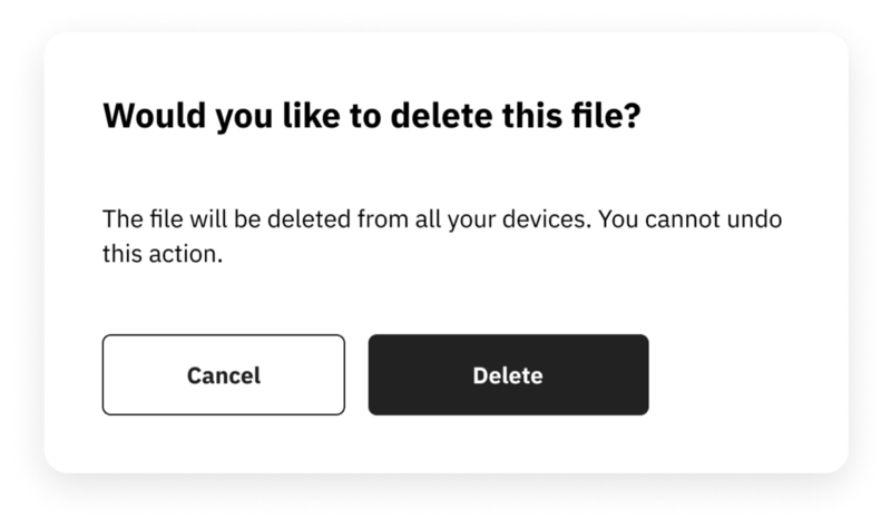
A confirmation dialog must restate the user’s request and explain what the system will do if the request is confirmed. This allows users to understand the effects of their actions. Presenting the action as a question is a way to attract the user’s attention and make them pause and consider their action. The example below demonstrates this.
The choice the user has to make should be clear. Microcopy is important in order to achieve this. Yes/No or vague options should be avoided (see a bad example of this below) and the choice should be reinforced in the button text (e.g., Delete account). Some explanation in the confirmation message is useful but the main message should be in the button text; users in a hurry are more likely to skip the rest of the message and focus on button text.
Destructive buttons often look different from other buttons. For example, applying a red tint to a button, helps the user identify that this is a destructive action. The colour supports the primary button’s label and firmly establishes its purpose. However, relying on colour alone is not appropriate due to accessibility and cultural differences. In particular, approximately 4.5% of the world’s population experience some form of colour blindness and using colour alone to convey meaning may effectively shun a significant proportion of our users. As a result, the button labels need to be descriptive enough to stand alone without colour. To give your warning signal more strength and be more accessible, an icon on the confirmation screen that represents the destructive action can also be displayed.
Using confirmatory dialogs for routine actions can affect the way users perceive destructive action dialogs. If users are presented with too many modals, they can become habituated to them, and they stop paying attention. As a result, the confirmation dialog loses its power to prevent errors.
The confirmatory dialog should be brief so that it is easily scannable. However, in some cases, users might want to find out more about the consequences of their actions before they commit. In these cases, progressive disclosure can be used.
Avoid giving confirmation dialogs default answers; the point of this modal is to prevent user errors by making users double-check their actions.
Ideally, we should allow users to undo destructive actions. The ohnosecond is the split second when you realise you’ve made a terrible mistake. Many applications allow users to undo such actions, either with undo controls or by giving users the ability to edit actions before they are finalised. This maps into another key component of another usability heuristic, user control and freedom. This can reduce user anxiety and allows them to recover from major problems. Users feel more in control of the product when they know they can undo actions and recover from their mistakes. Google’s Gmail has had an optional “undo send” feature for quite some time, which gives users a buffer of 20 seconds to undo their action.
If an undo button cannot be implemented, we can prompt users to type the destructive action in a text field to confirm (e.g., type delete/confirm/etc). Prompting them to type to confirm forces them to pause to read the modal text and make a conscious decision. While it’s possible to press the wrong button by accident, it’s impossible to type the action by accident as it requires deliberation. This should be used sparingly in very critical deletion operations. If used regularly, it could annoy users. An example is presented below.


Hello,
I am writing because I have a small doubt, the last example has a primary button labelled "confirm" and is coloured red.
Recently, I had a discussion about this issue, and the idea is that it is not a good practice to associate the colour red with a positive label. I would like to know what your opinion is.
Also, I would like to congratulate you on this article.
Thank you,
best regards
Luís